Neatness rejects involvement. A principle coined in 1993 now confirmed by hundreds of millions of ad impressions — and what it means for every business investing in professional creative.
The production company sent the final cut on a Tuesday. Colour-graded, sound-designed, thirty seconds of exactly what a professional ad is supposed to look like. The agency approved it. The client approved it. Everyone agreed it looked outstanding.
Three weeks later, the analytics told a different story.
Click-through rate: 0.4%. Cost per result: $87. The campaign had spent $4,200 and generated forty-eight leads.
That same week, someone on the team had posted a thirty-second phone video to test an angle. No edit. No music. No lower-thirds. Just the founder, slightly off-centre, in their actual office, talking about one problem their clients brought to them last month.
Cost per result: $11.
Same business. Same offer. Same audience. One of them looked like an ad. The other one didn’t. And the one that didn’t was the one people watched.
Three Words Written in 1993 That Explain Your Ad Performance Today
Lewis M. Smith was creative director of Wunderman Worldwide, one of the world’s largest direct marketing agencies. Sometime in the early 1990s, he distilled thirty years of watching what made people respond to advertising into three words:
Neatness rejects involvement.
He wasn’t being philosophical. He was describing a specific, observable phenomenon: direct mail pieces that were too clean, too organised, too obviously designed tended to get thrown away. The cluttered ones — layered, busy, multiple visual elements competing for attention — got picked up, read, foraged through. The mess invited investigation. The polish said “nothing urgent here.”
Denison Hatch, who spent decades building the world’s largest private library of direct mail samples, agreed. In his analysis of winning mail packages, he noted that the best-performing pieces were often “extremely interruptive” — they jerked the eye, highlighted benefits, showed the product from multiple angles. They weren’t restful. They were demanding. And demanding creative got responses.
That was 1993. Direct mail. The principle has since been confirmed across hundreds of millions of digital ad impressions, 57 million landing page conversions, and case studies from brands that grew from zero to nine figures on the back of deliberately imperfect creative.
The medium changed. The brain didn’t.
What Meta's Own Data Says
In 2019, Meta ran an internal study comparing self-recorded, mobile-shot creative against studio-produced alternatives. The results were not close. Lo-fi content outperformed studio creative in Facebook and Instagram Stories 84% of the time for content views. It was 63% more likely to generate lower-funnel outcomes — purchases and app installs — than its polished counterpart.
That data has only sharpened over time. Brainlabs’ 2025 analysis of 225 UK campaigns — 46 Meta brand lift studies, Random Forest regression modelling — found that lo-fi native creative was the single strongest driver of purchase intent, lifting it by 6% versus a 4% average across all creative types. When paired with the right campaign objective, that purchase intent lift reached 9.7% — more than double the platform average.
UGC-based ads achieve up to four times higher click-through rates and can reduce cost-per-click by up to 50% compared to traditional branded assets. H&M’s creator-led campaigns on Meta achieved two times the incremental ROAS. Mosh cut cost per lead by 53%.
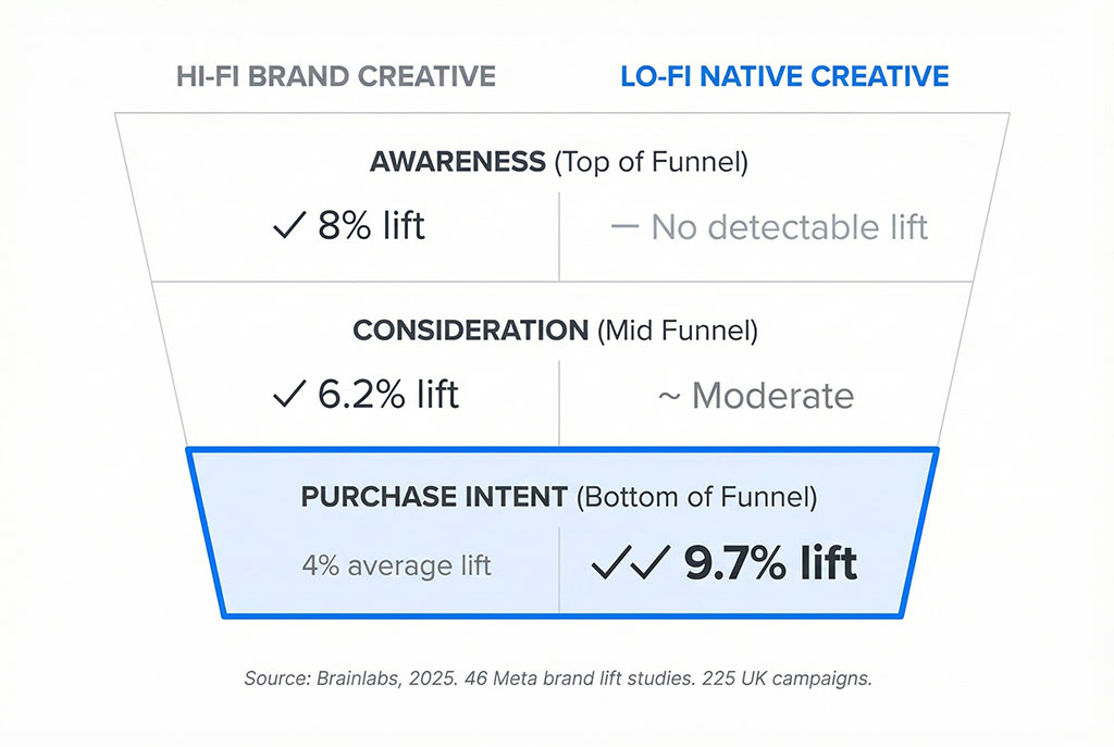
One important nuance — and this matters for how you think about your marketing mix: high-production brand creative still drives stronger awareness at the top of funnel. The Brainlabs data shows hi-fi content delivers an 8% awareness lift where lo-fi shows no detectable effect. These aren’t interchangeable tools. They serve different stages.
But the moment you’re optimising for clicks, responses, and revenue — the work that actually pays the bills — raw authenticity is the stronger bet. Every time.
The algorithm knows this too. Meta’s Andromeda retrieval engine, rolled out in late 2025, processes ad signals at 100 times the speed of its predecessor. Its function is to match creative to audience — and what it’s learned from processing billions of impressions is that lo-fi content carries more engagement signal. In the current system, the ad itself is the primary targeting tool. Polished creative that doesn’t generate engagement doesn’t just underperform — it actively signals the algorithm to charge you more.
The Trust Gap Nobody Is Talking About
Here is the statistic that should end every conversation about whether your marketing needs to look professional.
In Stackla’s survey of 1,590 consumers, 92% of marketers said they believed their brand content resonated with consumers as authentic. When consumers were asked the same question, 19% agreed.
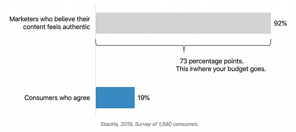
Ninety-two percent versus nineteen percent. The gap between those numbers — 73 percentage points of misplaced confidence — is where most marketing budgets disappear. Marketers are producing content that feels authentic to them and alien to the people they’re trying to reach.
This isn’t a failure of execution. It’s a failure of category. Professionally produced marketing, by definition, looks like professionally produced marketing. And professionally produced marketing has been trained out of consumers’ attentional systems by decades of overexposure. Nielsen Norman Group’s eyetracking research shows users fixate on ad-like content less than 1% of the time. They don’t consciously ignore polished ads. Their visual systems route around them automatically, the way experienced drivers route around billboards on a familiar road.
Lo-fi content doesn’t win because consumers have low standards. It wins because it doesn’t look like an ad. And anything that doesn’t look like an ad gets processed by a different part of the brain — the part that’s still paying attention.
But You're Not Selling Soap
Here’s where most small business owners decide this doesn’t apply to them.
Dr. Squatch is a men’s soap brand. Dollar Shave Club sells razors. These are impulse-purchase consumer products with mass-market audiences. You’re a physiotherapist, or an architect, or a financial planner, or a specialist manufacturer. Your clients are educated. They’re paying for expertise. They’re making considered decisions over weeks or months, not clicking an ad on Saturday morning because a video made them laugh.
You’ve invested in looking professional for good reason. If your ads suddenly look like they were filmed in someone’s garage, you’ll lose the clients you’re trying to attract.
This objection is reasonable. It’s also based on a false choice.
The research isn’t asking you to look incompetent. It’s asking you to look human. Those are different things. A physiotherapist who films a thirty-second talking-head video explaining why a specific type of knee pain is harder to treat than most people expect — no graphics, no music, just them in their clinic speaking directly to camera — doesn’t look amateur. They look like someone who knows exactly what they’re talking about and doesn’t need a production crew to communicate it.
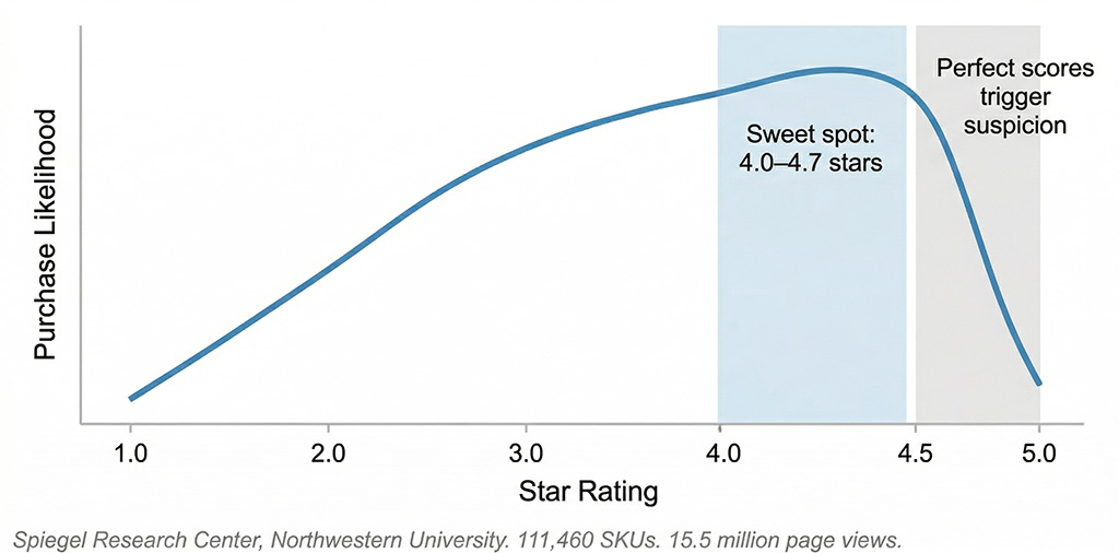
The Spiegel Research Center analysed 111,460 SKUs across 15.5 million page views. They found that purchase likelihood peaks at a 4.0 to 4.7 star rating — and declines as ratings approach 5.0. Perfect scores trigger suspicion. Consumers have learned that a flawless record means a filtered record. Imperfection, within range, signals authenticity.
The Pratfall Effect has been documented since 1966: competent people who display small imperfections are rated as more likable than those who appear flawless. This holds in professional contexts, not just consumer ones. The financial planner who says “we don’t always get the timing right on these things, but here’s what our clients’ portfolios have done over ten years” is more persuasive than the one with the glossy case study deck that shows nothing but wins.
Production quality and credibility are independent variables. You can have both. What you cannot have is an ad that looks exactly like an ad and then expect people to stop and watch it.
What This Actually Means for Your Marketing
Three changes, each with evidence behind them.
Your ads should look like content, not campaigns.
This isn’t about lowering your standards — it’s about matching the format to the environment. A talking-head video shot on a decent phone, in your actual workspace, with your actual words, will outperform a scripted, colour-graded brand film in most direct-response contexts.
Dr. Squatch scaled from $3 million to $100 million annually behind videos that prioritised personality over production. Dollar Shave Club built a billion-dollar brand on a $4,500 shoot in a warehouse. The creative velocity data from $1.3 billion in Meta ad spend suggests the brands finding the most winners aren’t making better ads — they’re making more of them. Ten or more per week. Finding the 4% to 8% that scale through volume, not perfection.
Your landing pages should minimise choice, not showcase options.
Hick’s Law — established in 1952 and confirmed across 57 million conversion events — states that decision time increases logarithmically with the number of options presented. Removing navigation from a landing page doubles conversions. Reducing form fields from five to three increases completions by 50%.
Expedia removed a single field — “Company Name” — and generated $12 million in additional annual revenue. Not from a redesign. From a deletion.
Your landing page may be beautiful. If it’s also full of choices, it’s full of exits.
Your creative process needs volume before it needs quality control.
The constraint on most small business marketing isn’t budget. It’s the belief that everything going out must be finished before it goes out. Meta’s own data shows the average user sees the same creative 4.2 times — and at four exposures, conversion likelihood drops by 45%. The creative that looked polished on launch looks tired three weeks later.
Raw assets refresh faster. They cost less to produce. And they’re what the algorithm is currently rewarding with lower CPMs and broader reach.
The colour-graded ad is still running. It still looks outstanding. The team is still proud of it.
Somewhere in the same account, there’s a thirty-second phone video — slightly off-centre, natural light, the founder talking directly to camera about one problem they solved last month. No music. No lower-thirds. Nothing that looks like it cost anything.
Pull up the analytics. Compare the two rows.
Same business. Same offer. Same audience. One of them looks like marketing. The other one looks like a person. And people — as it turns out, as it has always turned out, as Lewis M. Smith said in 1993 — stop for people.
Neatness rejects involvement. It always has.
Is your marketing too polished to work?
Most audits we run surface the same problem: businesses doing solid work, with a genuine story inside them, but advertising that looks so considered, so produced, so finished — it slides right past the people it was made for.
The rawness is already there. Nobody’s pointed a camera at it yet.
Takes 30 minutes.