
Neatness rejects involvement. Three words from a direct mail creative director more than fifty years ago, and what the platform data since then does and does not support.
The production company sent the final cut on a Tuesday. Colour-graded, sound-designed, thirty seconds of exactly what a professional ad is supposed to look like. The agency approved it. The client approved it. Everyone agreed it looked outstanding.
Three weeks later the analytics told a different story.
Click-through rate: 0.4%. Cost per result: $87. The campaign had spent $4,200 and produced forty-eight leads.
That same week someone on the team posted a thirty-second phone video to test an angle. No edit. No music. No lower-thirds. Just the founder, off-centre, in the actual office, talking about one problem a client brought them last month.
Cost per result: $11.
Same business. Same offer. Same audience. One looked like an ad. One didn’t. The one that didn’t was the one people watched.
That is a single account over a single month. It proves nothing on its own. What follows is the evidence, with its limits attached.
Three Words From the Direct Mail Era
Lew Smith built his career in direct response. He was EVP and creative director of the Wunderman agencies. He compressed what he had learned into three words:
Neatness rejects involvement.
He meant something specific. Mail packages that looked too clean, too organised, too obviously designed went in the bin. The crowded ones, layered, busy, several elements fighting for the eye, got picked up and read through. Mess invited investigation. Polish said nothing here is urgent.
Denny Hatch recorded the line. Hatch spent decades assembling a private archive of roughly 20,000 direct mail controls across 85 categories, and he described winning packages in similar terms. Of one high performer he wrote that “this thing moves the eye all over the place.” Restful was never the goal.
Where this comes from, and what it is worth. The phrase traces to Hatch’s account of working under Smith in the late 1960s and early 1970s. Hatch is the only source for the line and for Smith’s title. It was never a study. It is a practitioner’s observation from a paper medium, which makes it a hypothesis worth testing rather than a finding to cite. So here is the test.
What the Platform Data Says
In 2019 Meta compared self-recorded mobile creative against studio-produced alternatives. Two separate findings from that work usually get quoted as one. On Facebook Stories, lo-fi creative beat studio creative 84% of the time for content views. On Instagram Stories, a different surface and a different measure, lo-fi was 63% more likely to drive lower-funnel outcomes such as purchases and app installs.
The sourcing matters here. Meta’s original page is offline. The most cited surviving write-up is an Ad Age article from June 2021 carrying a “Publishing Partner: Meta” flag, which makes it sponsored content from the company whose auction is being described. Directional, from an interested party, not independent measurement.
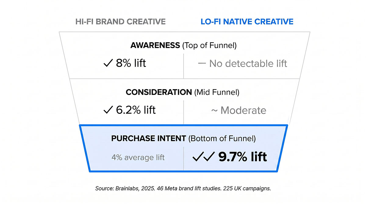
Brainlabs, a media agency, ran the more rigorous version. Across 225 UK campaigns and 46 Meta brand lift studies, using Random Forest regression, lo-fi native creative came out as the strongest single driver of purchase intent, lifting it 6% against a 4% average across creative types. The dataset is the agency’s own book of business rather than a market sample.
Where the 9.7% comes from. A 9.7% figure circulates alongside this research, usually as a purchase intent lift against a 4% baseline. It is neither. In the Brainlabs data it is a combined lift under the View Content objective, measured against an 8% baseline, and it rests on ten brands. The metric and the baseline both get swapped in transit.
Brainlabs also found high-production creative delivering an 8% awareness lift, on one condition that the headline drops: delivery to a net new reach audience. Brainlabs does not name lo-fi as the comparator that showed no detectable lift there. That comparison is an inference, and it has been removed from this article. What remains is narrower and still useful: polished creative earns its place at the top of the funnel, and the data does not tell us it beats lo-fi there.
H&M reported two times incremental ROAS from creator-led work. That figure comes from H&M’s own Shorty Awards submission, covers one campaign (Find Your Beach, US, June to August 2024), and ran across several platforms rather than Meta alone. Self-reported, single campaign, worth reading as a signal and nothing firmer.
Two claims that circulate widely have been cut from this article. UGC ads achieving four times the click-through rate and half the cost per click traces to a UGC marketplace citing its own statistics page, which credits a Shopify article that does not contain the claim. Mosh cutting cost per lead by 53% is asserted only by a Meta automation vendor and cannot be verified against either source it points to.
The algorithm's actual role.
Meta announced Andromeda in December 2024, not late 2025. It is a retrieval system. Its job is to narrow tens of millions of eligible ads down to a few thousand candidates for the ranking stage. The 100x figure attached to it measures feature extraction latency and throughput against the previous CPU-based components, which is a hardware benchmark rather than a claim about ad signal processing overall.
One popular line about Andromeda appears in no Meta documentation: that the creative itself has become the primary targeting tool. It has been removed here. The duller version is the accurate one. Predicted engagement has always shaped what gets served. Andromeda widens the pool that prediction runs across, so creative that earns engagement has more chances to surface.
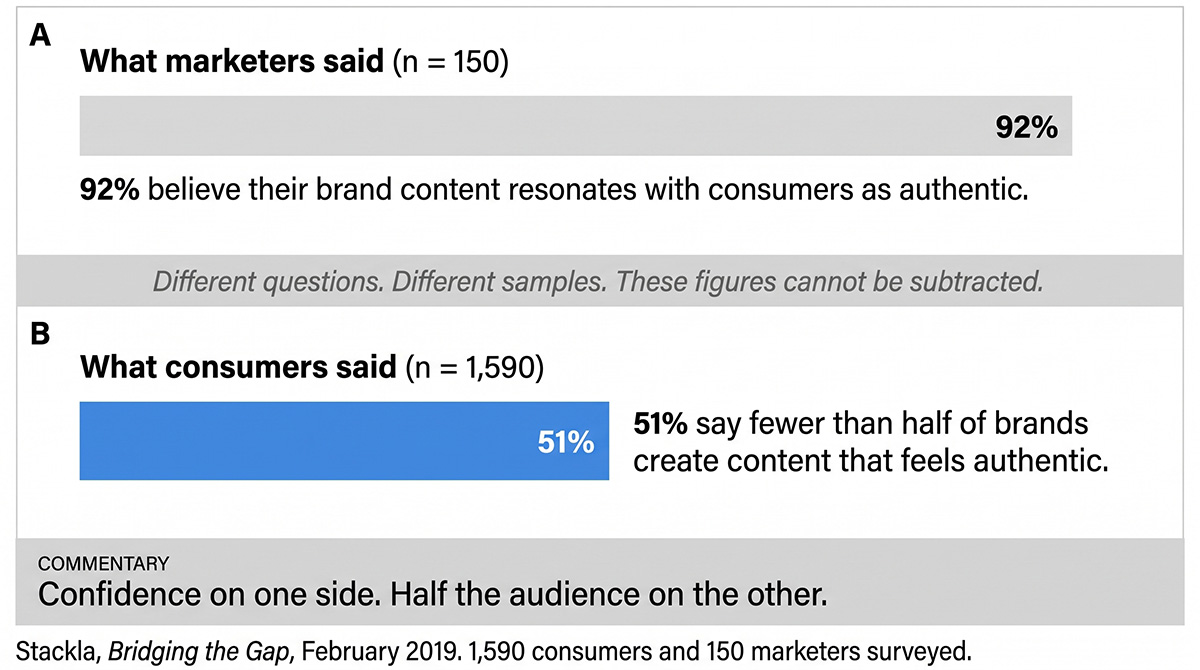
Stackla’s February 2019 report Bridging the Gap surveyed 1,590 consumers and 150 marketers. Among the marketers, 92% believed their brand content resonates with consumers as authentic. That number rests on 150 people. The consumer sample has nothing to do with it.
Consumers were asked a different question, so there is no matching figure to set against it. What they said: 51% report that fewer than half of brands create content that feels authentic to them.
Two questions, two samples. Subtracting one from the other produces a gap that does not exist. What survives the correction is still uncomfortable reading. Near-total confidence on one side of the table. Half the audience on the other side saying most brands miss.
This isn’t a failure of execution. It is a failure of category. Professionally produced marketing looks like professionally produced marketing, and decades of overexposure have trained that look out of people’s attention.
Nielsen Norman Group has the strongest evidence on that point, though not the number usually quoted. In a 2007 study, 86% of users failed to find information that had been styled to look like a promotional banner. A later eyetracking study (Pernice, 2018, 26 participants) recorded fixations on one page’s right rail at 0.8% of viewing time. That small number gets quoted as a general rate for all ad-like content. It describes one rail on one page. The 2007 finding is the one that carries weight, and it is enough: people do not decide to ignore ads, their attention routes around anything shaped like one.
Lo-fi creative doesn’t win because audiences have low standards. It wins because it doesn’t trip the filter.
But You're Not Selling Soap
Here is where most business owners decide this doesn’t apply to them.
Dr. Squatch sells men’s soap. Dollar Shave Club sells razors. Impulse purchases, mass audiences. You are a physiotherapist, an architect, a financial planner, a specialist manufacturer. Your clients are educated, they are buying expertise, and they decide over weeks rather than on a Saturday morning because a video made them laugh.
You invested in looking professional for good reason. If your ads start looking like they were shot in a garage, you lose the clients you want.
Reasonable objection. Also a false choice.
The research doesn’t ask you to look incompetent. It asks you to look human. A physiotherapist who films thirty seconds explaining why one type of knee pain resists treatment longer than patients expect, no graphics, no music, just them in the clinic talking to camera, doesn’t read as amateur. They read as someone who knows the subject well enough to explain it without a crew.
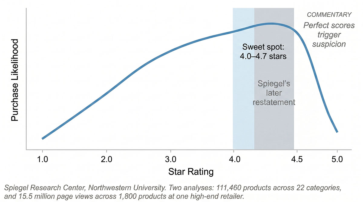
The Spiegel Research Center at Northwestern ran two analyses that get merged in most retellings. One covered 111,460 products across 22 categories. A separate one covered roughly 15.5 million page views across 1,800 products at a single high-end retailer. Across the work, purchase likelihood peaks between 4.0 and 4.7 stars and falls away as ratings approach 5.0. Spiegel later narrowed that peak to 4.2 to 4.5. Perfect scores read as filtered scores.
The Pratfall Effect points the same way, with a condition attached that the popular version drops. In Aronson, Willerman and Floyd’s 1966 experiment, a clumsy blunder made the highly competent performer more likeable. The same blunder made the mediocre performer less likeable. Replication has been mixed since: Helmreich and colleagues found the effect reversed for observers with high self-esteem in 1970.
That condition is the useful part. Imperfection reads as humanity only where competence is already on the table. The financial planner who admits the timing isn’t always right can afford the admission because the ten-year numbers sit on the same page. Without the numbers it is just an admission.
Production quality and credibility are independent variables. You can have both. What you cannot have is an ad that looks exactly like an ad and an audience that stops to watch it.
What This Actually Means for Your Marketing
Three changes, each with its evidence and its limits.
Your ads should look like content, not campaigns.
This isn’t about lowering standards. It is about matching the format to the environment. A talking-head video shot on a decent phone, in your workspace, in your words, will out-earn a scripted brand film in most direct response contexts.
The two case studies everyone reaches for need correcting before they can be used.
Dr. Squatch grew from roughly $3 million in 2018 to $100 million in 2020, both figures as reported by Forbes. The story attached to that growth, personality over production, does not survive contact with the record. The breakout video reportedly cost around $18,000, was made with the agency Raindrop, and featured a professional comic performer. Founder Jack Haldrup credits paid media, video, and outside investment. The lesson isn’t that cheap wins. It is that native wins, and looking native takes craft.
Dollar Shave Club’s launch video cost $4,500. Verified. What usually follows it isn’t. The company raised more than $100 million in venture capital across four rounds between the 2012 video and the 2016 Unilever exit, at roughly $200 million in revenue and still unprofitable. Unilever has never confirmed the billion-dollar figure and later wrote the asset down. A $4,500 video opened the door. Nine figures of capital walked through it.
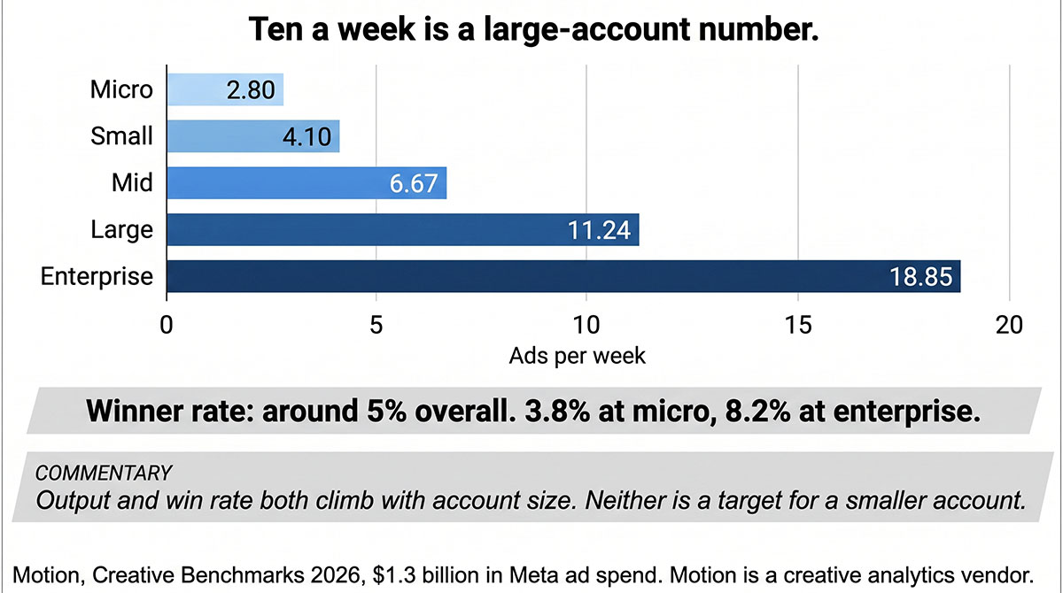
On volume, Motion, a creative analytics vendor, analysed $1.3 billion in Meta ad spend for its Creative Benchmarks 2026. Around 5% of ads become winners overall, running from 3.8% at micro accounts to 8.2% at enterprise. Output climbs with account size across every tier: micro accounts ship 2.80 ads a week, small 4.10, mid 6.67, large 11.24, enterprise 18.85. The ten-a-week figure in circulation is a large-account number, and enterprise ships close to double it again. Motion frames volume as probability rather than prescription: more attempts, more chances at a winner. Ship what your account can sustain, and expect most of it to lose.
Your landing pages should reduce choice, and for the right reason.
Hick’s Law is real. W. E. Hick established in 1952 that choice reaction time grows logarithmically with the number of options, RT = a + b·log₂n. Its scope is narrower than marketing writing suggests. Proctor and Schneider’s 2018 review finds practice flattens the slope, strong stimulus-response compatibility removes it, and the law does not describe scanning an unsorted list. A navigation menu is an unsorted list. Hick’s Law is therefore not the reason to strip your nav, and the 57 million conversions often cited alongside it come from Unbounce’s Conversion Benchmark Report, which benchmarks conversion by industry, source, device and reading level and tests nothing about choice count.
There are better reasons, and real numbers behind them.
Removing navigation from a landing page helps. The claim that it doubles conversions comes from one page in 2011: Yuppiechef’s wedding registry, 3% to 6%, with no sample size or significance published. HubSpot later tested the same idea across five of its own pages and found 0% to 4% at top of funnel and 16% to 28% at mid funnel. HubSpot sells landing page software, so that is a vendor testing its own product on its own pages. Useful, mid-funnel especially. Not a doubling.
Shorter forms convert better. Two pieces of evidence get quoted together on that point, and they are different kinds of evidence.
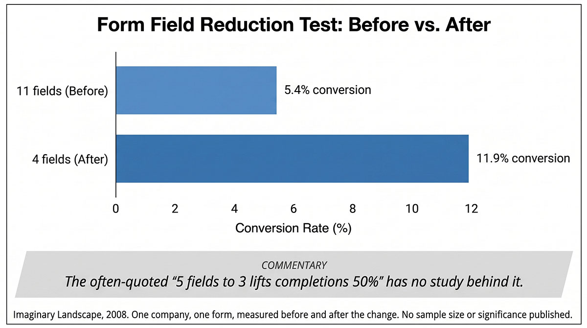
Imaginary Landscape cut a form from 11 fields to 4 in 2008 and conversion moved from 5.4% to 11.9%. That is a before and after test on one form at one company, with no sample size or significance published.
Dan Zarrella’s analysis of more than 40,000 HubSpot landing pages found three-field pages converting at 25% and five-field pages at 21%. Nothing was removed in that study. It compares pages that already existed, built by different people for different offers, at a single point in time. The curve does not even run in one direction: it dips between three fields and four, then rises again at five. Zarrella was HubSpot’s Principal Social Media Scientist and HubSpot sells form software, so read it as vendor data.
One is a test. One is a snapshot. Neither produces the widely repeated “five fields to three lifts completions 50%”, which has no study behind it at all.
Expedia removed one optional field, Company, and the fix was reportedly worth $12 million a year in profit. Profit, not revenue, which is a material difference for a travel intermediary. The mechanism is the part worth keeping: some users read Company as their bank’s name, entered the bank’s address in the fields below, and their payment authorisation failed. This comes from a single 2010 conference talk and has never been independently verified. Read it as a reason to test your own forms rather than as a benchmark.
Your landing page may be beautiful. If it is also full of choices, it is full of exits.
Your creative process needs volume before it needs quality control.
The constraint on most small business marketing isn’t budget. It is the belief that everything must be finished before it goes out.
Creative fatigue is the reason that belief costs money. Meta’s May 2023 regression found conversion likelihood dropping around 45% by the fourth exposure. The 4.2 figure often quoted next to it is not what people think: it is an impression-weighted mean of prior exposures across Meta ad impressions, which overweights heavy users and counts exposures before the impression being measured. It is not the number of times the average person sees your ad, and it is not a schedule.
The point holds anyway. Creative wears out faster than production timelines assume. Raw assets refresh faster and cost less, which is the practical argument for making more of them.
The colour-graded ad is still running. It still looks outstanding. The team is still proud of it.
Somewhere in the same account there is a thirty-second phone video. Off-centre, natural light, the founder talking to camera about one problem they solved last month. No music. No lower-thirds. Nothing that looks like it cost anything.
Pull up the analytics. Compare the two rows.
Same business. Same offer. Same audience. One looks like marketing. One looks like a person. Lew Smith worked that out with paper and a mailing list. The platforms have spent six years arriving at a narrower version of the same thing.
Neatness rejects involvement. Within limits, and now with a bibliography.
Your marketing, looked at properly
Thirty minutes on your current setup — what’s working, what’s quietly leaking budget, and what I’d fix first. You’ll leave with a clearer picture whether we work together or not.
Got something specific bugging you? Flag it when you book and I’ll have it looked at before we talk.

AboutBruce Marjoribanks
Bruce Marjoribanks has spent 27 years in marketing, including building, running and selling his own agency before going independent. He now runs every channel - paid, organic, social, email, creative and automation - as one integrated system, with AI ehancing production and the judgment staying human.