
A client told me six months ago he was redesigning his website. I asked whether he had briefed the designer on his offer, his audience, his conversion goals. He said the designer “handles all that.”
I did not hear from him again until last month.
The new site looked incredible. Custom photography. Scroll animations. The designer called it “clean and modern.” His analytics called it something else. Not a disaster. Worse. The same. Same traffic. Same enquiries. Same conversion rate, almost to the decimal. Fifteen thousand dollars, a website he was finally proud of, and nothing had changed.
He wanted to know what went wrong. Nothing went wrong. The designer delivered exactly what was asked for, which was a better looking website. Nobody asked for a better performing one.
The pattern I've watched repeat for 20 years
I have been running digital strategy for two decades. In that time I have audited hundreds of websites after launch. The number that produced more sales was roughly one in ten.
Not because the designs were bad. Most of them looked excellent. The problem was the same every time, and it was never visual.
The design improved. The offer did not. The messaging did not. The traffic strategy did not change. The same audience landed on the same proposition in a prettier wrapper, and did exactly what it had always done.
It is like repainting a restaurant that serves bad food. The walls look great. The kitchen has not changed. And you are wondering why nobody comes back for seconds.
Eight in ten redesigns fall short of what they could have been
In 2023, SoftwareReviews, part of Info-Tech Research Group, put the figure at 80%. Eight in ten website redesigns fall short of their full potential.
Read that carefully, because it is a softer claim than the one you usually see quoted. It does not say eight in ten redesigns lose money. It says eight in ten leave value on the table. SoftwareReviews does not publish a sample size or a method for that number, and it sells advisory services in the same market, so I would not build a business case on it. Even at its weakest, it describes an industry where falling short is the normal outcome.
That matches what I see, and what I see is harsher.
When a redesign is planned badly, organic traffic is the first thing to go. In the audits I have run, the drop usually lands somewhere between 10% and 40% in the weeks after launch, and it is worst when nobody mapped the old URLs to the new ones. I have watched a business lose almost all of its organic visibility overnight because someone changed a URL structure without telling Google where the old pages went. Those figures are mine, from my own client work. They are not survey data and I am not going to dress them up as survey data.
The money is real too. The redesign quotes I see land in front of Australian small business owners usually sit between $10,000 and $25,000.
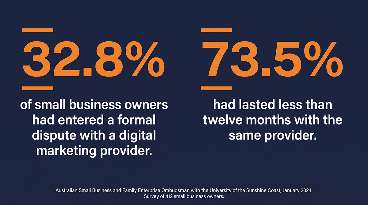
Here is the part with proper evidence behind it. In January 2024, the Australian Small Business and Family Enterprise Ombudsman published research carried out with the University of the Sunshine Coast, based on a survey of 412 small business owners and 20 follow-up interviews. Almost a third of them, 32.8%, had entered a formal dispute process with a digital marketing provider. That category covers SEO, paid advertising, social media and web work together. And 73.5% had lasted less than twelve months with the same provider.
A third in formal dispute. Three quarters gone inside a year.
Those disputes almost never start because the work looked bad. They start because the business expected the site to bring in work, and it did not.
Where the money actually disappears
Two things break, and they break in a predictable order.
Your search equity goes first. Your old site earned its authority over years. Backlinks, indexed pages, keyword rankings, built one page at a time. A redesign that changes URL structures without proper redirects erases that in a night. Every backlink pointing at a page that no longer exists becomes a dead end. Google stops sending traffic because, as far as Google can tell, your content is gone.
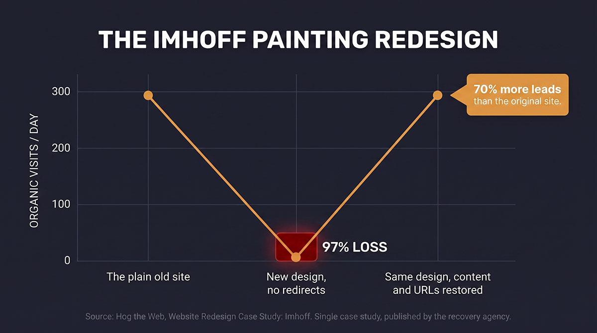
One case study documents this in detail. Imhoff Painting had a plain website pulling around 300 organic visits a day. Their new agency delivered a much better looking redesign and did not migrate the service pages and blog posts that earned that traffic. Within a month, daily visits fell from about 300 to about 10. Three hundred to ten.
Worth knowing where that comes from: the case study is published by Hog the Web, the agency brought in afterwards to fix it. It is one documented example, not a measured pattern, and the firm reporting it sells the recovery work. I use it because the before and after are unusually well evidenced, not because one client proves anything.
Then design eats the message. Designers build wireframes with placeholder text. Beautiful, symmetrical blocks of Lorem Ipsum. Then the real copy, the words that explain what you do, who it is for and why they should care, gets crammed into those rigid boxes like furniture into a flat that is too small. The value proposition disappears under a full-screen hero video. The testimonials get buried. The call to action hides in a hamburger menu because a visible button “ruined the aesthetic.”
A visitor who cannot work out what you do in the first few seconds leaves. You will see a statistic quoted for that constantly, usually 88% of consumers, usually three seconds. Both come from page load speed research, which measures how long people wait for a slow page, not how long they spend trying to understand one. The 88% comes from a Gomez and Compuware consumer survey fielded in February 2010, over sixteen years ago. The three-second figure is newer but still dated: Google’s 2016 report The Need for Mobile Speed, based on Analytics data collected in March 2016. Different problem, older internet. So I am not going to hand you one. Watch your own session recordings instead.
"But I'm not a marketer — that's why I hired a designer"
I hear this constantly, and it is a fair objection. You run a plumbing business, or a law firm, or an ecommerce store. You hired a professional to handle the website precisely because you do not know how to build one. You should not need a marketing degree to get a site that works.
There is a line, though, and it sits in an awkward place. Your designer’s job is to make it look good. Your job, the part only you can do, is to make it sell. Those are two different skills. Asking your web designer to handle your sales strategy is like asking your architect to decide what business you run from the building. They will give you a beautiful structure. They cannot tell you what to put inside it.
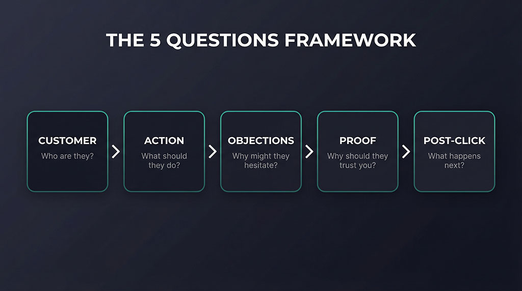
You do not need to become a strategist. You need ten minutes and five questions. Ten minutes of clarity saves ten thousand dollars of guessing.
The five questions your designer can't answer (but you must)
Before a single pixel gets pushed, you need written answers to these.
Who exactly is your customer? Not “everyone.” The specific person. What is their job? What keeps them up at night? What have they already tried that did not work? Your designer does not know this. You do.
What is the single action you want them to take? Call you? Fill out a form? Book online? Buy a product? Pick one. A site that asks visitors to do five things gets them to do none.
What objections will they have? Is this too expensive? Will it work for my situation? Can I trust these people? Every visitor arrives with silent objections. Your site needs to answer them before they are asked. Your designer has no idea what they are.
What proof do you have? Testimonials, case studies, before and after photos, data, awards. The specific evidence that makes a sceptical visitor decide you are legitimate. If it is not on the site, it does not exist.
What happens after they click? An instant confirmation? A phone call within the hour? A three week wait? What happens after the form is submitted decides whether your leads become customers or ghost stories. Map it out.
Hand your designer those five answers and the site almost builds itself. Hand them a logo and “make it modern” and you get a $15,000 brochure.
Same website. Different strategy. Completely different result.
The Imhoff story has a second act. After the collapse, a recovery team came in. They did not scrap the new design, which was genuinely better looking than the original. They restored the old content, rebuilt the URL structure so the backlinks pointed somewhere again, and rewrote the copy with clear calls to action, visible testimonials and service pages that matched what customers were actually searching for.
Organic traffic came back to around 300 visits a day within a month. Then the part that matters. With the restored content now sitting inside the new design and paired with copy written to sell, Imhoff reported a 70% increase in leads over the original site. Same design. Different strategy. Seventy percent more business.
Conversion Sciences documents two more cases, and they are worth keeping apart, because most articles run them together.
The first is Wasp Barcode, a B2B company that ran its redesign in stages instead of all at once. Its design team redesigned one category page at a time, each new design split-tested against the existing page as control, with only the winners rolled out. Live demos grew by more than 200% in a few months, reported as 250% over six months. The gains were banked during the redesign, not after it.
The second is a different client, an unnamed B2B ecommerce company. Its four month redesign stretched to six months, then to fourteen. The new design did launch, and after fourteen months conversion rate and revenue per visit were about the same as before. Fourteen months of work, and the numbers did not move.
Two companies, both redesigning. One tested its way through and grew. One went dark for fourteen months and stood still.
Test your way into a redesign instead of betting on one
If that sounds like I am telling you a series of small tested changes beats one big untested overhaul, that is exactly what I am telling you.
Before you spend $15,000 on a new site, spend two hours answering the five questions. Then test a new headline on the site you already own. Rewrite your calls to action so they say what happens next. Put the testimonials you have been sitting on somewhere people will actually see them. Fix the one page that gets the most traffic and the fewest enquiries.
You may find the site you already have only needed better inputs.
About that client with the $15,000 website
We did not touch his new design. Not a colour, not a single image. The designer’s work was good, and that was never the issue. What we changed was everything the designer was never asked to think about.
We rewrote his homepage headline from a vague “Quality Solutions for Your Business” to a specific promise that named his customer’s problem in their own words. We surfaced three client testimonials that had been buried on a subpage nobody visited. We replaced “Contact Us” with a call to action that told visitors exactly what would happen when they clicked.
Same website. Same fifteen thousand dollars already spent.
But for the first time, someone briefed the strategy before judging the design. The analytics stopped telling the same story.
Your marketing, looked at properly
Thirty minutes on your current setup — what’s working, what’s quietly leaking budget, and what I’d fix first. You’ll leave with a clearer picture whether we work together or not.
Got something specific bugging you? Flag it when you book and I’ll have it looked at before we talk.

AboutBruce Marjoribanks
Bruce Marjoribanks has spent 27 years in marketing, including building, running and selling his own agency before going independent. He now runs every channel - paid, organic, social, email, creative and automation - as one integrated system, with AI ehancing production and the judgment staying human.