
Performance Analytics is the discipline that turns account data into decisions about money. Its hardest job is not producing numbers. It is knowing which numbers are trustworthy enough to act on.
Key takeaways
- Every recommendation carries six things, including the volume it rests on and what would prove it wrong. Missing data is retrieved, never estimated.
- Two altitudes, deliberately separate: the Operator's decision layer naming what to scale and pause, and the client's funnel report.
- The base rate is humbling: Microsoft's experimentation team reported that only one third of ideas tested improved the metric they were designed to improve, worse in less well understood areas, and the first day of a test had a 67 percent chance of falling outside the confidence bound it eventually settled into.1
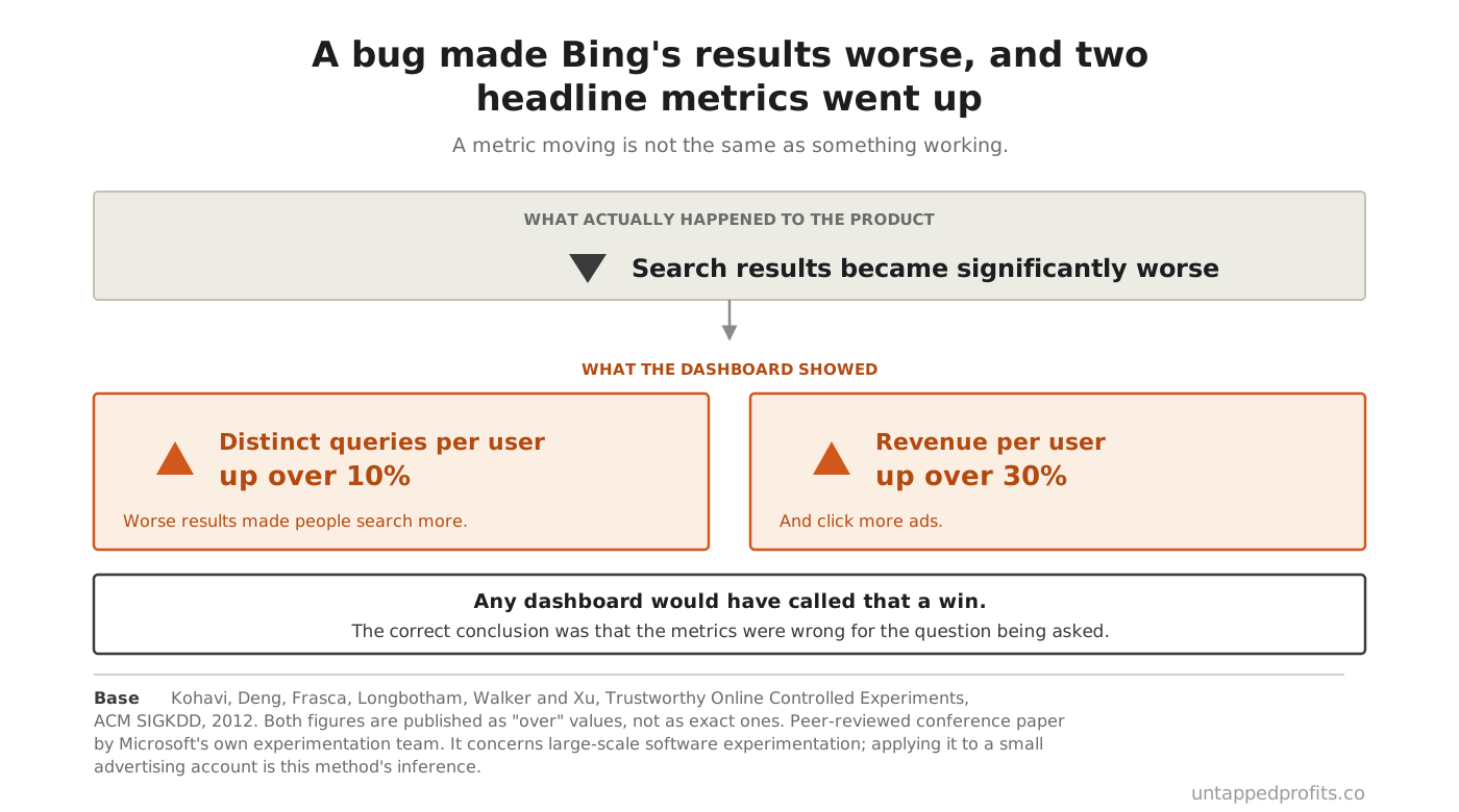
- A bug once gave Bing users much worse results, and two headline metrics improved: queries per user rose over 10 percent and revenue per user over 30 percent. A metric moving is not the same as something working.1
What does this layer actually decide?
What to scale, what to pause, and on what evidence. That is the Operator's job and it runs on its own artefact, capped at three things to scale and three to pause, because a list of fifteen actions is a list nobody performs. The client sees something different: a funnel report at their altitude showing what the money did. The two are separate on purpose.
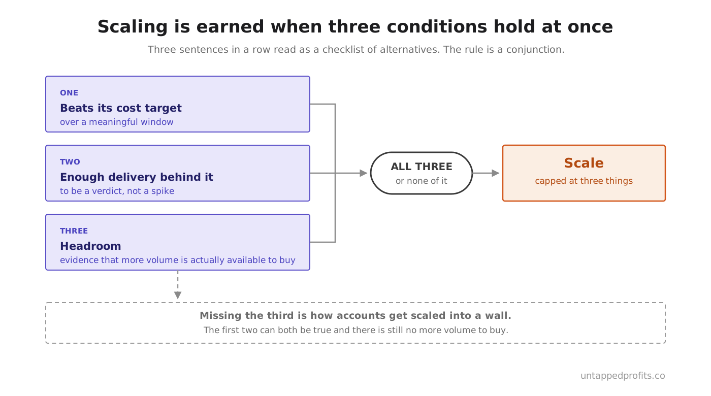
Something earns a scale decision only when three things hold at once. It beats its cost target over a meaningful window. It has enough delivery behind it to be a verdict instead of a spike. And there is headroom, meaning evidence that more volume is actually available to buy. Missing the third is how accounts get scaled into a wall.
Pausing has its own bar, and the first check is the cheapest in the discipline. Verify tracking is alive before concluding anything is failing, because at small budgets a broken tag and a failing campaign look identical in a report. That is also how agency reporting theatre survives — Your Google Ads Agency Reports Weekly Optimizations checked one such account against its own change history.
Why does every recommendation carry its evidence?
Because a recommendation is an instruction to move money, and a model with no data will still produce a fluent, confident, well-structured answer. Fluency is free and evidence is not. The failure mode is never an obviously wrong answer. It is a reasonable-sounding one built on numbers nobody checked, which is far harder to catch and far more expensive to act on.
| Every recommendation states | Because without it |
|---|---|
| The observation, with dates, scope and where it came from | Nobody can check it or reproduce it later |
| The comparison, ideally two: prior period and longer average | A trend and a blip look the same |
| The volume it rests on | Noise gets acted on as though it were signal |
| Whether this is a verdict, a signal or noise | Everything reads as equally certain |
| The recommendation and the size of the move | The advice cannot actually be carried out |
| What would prove it wrong, and when we would know | Nothing can ever be shown to have failed |
Where data is missing, the system retrieves it and never fills the gap. Saying that a bid change cannot be recommended without conversion volume at the right level is the correct output, and it is more useful than a confident move made blind. Assumed figures are banned outright, and so is the word "typically" standing in for this account's own numbers.
Below meaningful volume the honest answer is not yet. An account with three conversions in a fortnight cannot support a target change, a pause or a creative verdict however tempting the pattern looks. The rate at which good ideas fail is the reason this matters: Microsoft's own experimentation platform found only a third of tested ideas improved what they were meant to improve, so a system with no volume gate will confidently ship the other two thirds.1
How do you avoid being fooled?
By assuming you will be. The most instructive case in the literature is a bug at Bing that degraded search results badly, after which two headline business metrics rose sharply. Worse results made people search more and click more ads. Any dashboard would have called that a win, and the correct conclusion was that the metrics were wrong for the question being asked.
Early trends are the second trap and they are a statistical artefact rather than a signal. In the same work, an apparent four-day upward trend that everyone read as a feature winning turned out to be a test with no difference in it at all. The first day of a test had a two in three chance of landing outside the range the test eventually settled into, so watching a new campaign closely for three days produces confidence and nothing else. The authors put the whole discipline in one line: "Generating numbers is easy; generating numbers you should trust is hard".1
Two more habits do the rest. Segment before concluding, because an aggregate number hides its own explanation and a conclusion drawn from one total is a hypothesis wearing a verdict's clothes. And when something changed at the same time as something else, name every candidate explanation before choosing one, separating what changed in the world from what we changed in the account.
In practice
Grade last period's calls before making this period's. Did the things you scaled do what you said they would, and did the things you paused turn out to deserve it? Almost nobody does this, which is why the same wrong instinct can run for a year without anyone noticing. It costs one read of last period's report, and it is the only feedback this discipline gets.
What do the failures look like?
They repeat, which is why they are named rather than re-derived each time. Reach without results, where impressions are fine and the business metrics are dead. The engagement cliff after a period of health. Content fatigue, where the same angles produce diminishing returns. Platform spread, where too many channels are run and none properly. Naming a pattern turns a mystery into a diagnosis with a known fix.
Diagnosis has an order. Check the foundations before the tactics, because a conversion problem is usually a problem further up. Never stop at the first symptom, since the first answer to why something fell is almost never the cause. And split the problem so the branches do not overlap, which stops one effect being counted twice under two explanations.
Targets come from the client's own baseline plus a defensible increment, never from a published benchmark table. Those tables go stale, they describe other businesses, and a cost target lifted from one becomes a ceiling the account never tries to beat — Your CPA Target Is a Ceiling You Built Yourself is that ceiling, measured.
Watch for
Platform-reported conversions being treated as the truth. Every ad platform counts generously and they overlap with each other, so adding them up produces more conversions than the business actually had. Which system is the truth for which question is ruled once, in Lead Tracking and Pipeline. The working rule here is simpler: say which source every number came from.
Frequently asked questions
How long should a change run before it is judged?
Long enough to carry a verdict, which is a volume question and not a calendar one. One good or bad week is weather. What matters is whether enough conversions have accumulated on the thing being judged, and where they have not, the honest answer is to judge one level up.
Why not use industry benchmarks?
Because they describe other people's accounts, other people's offers and often other people's countries. A benchmark quoted as though it were this account's data is banned outright here, and what everyone else does is never on its own a justification for moving money.
What if the client wants more detail than the report has?
It gets translated into the report's language rather than handed over raw. The Operator's decision layer is a working artefact full of channel mechanics, and pushing that at a business owner shifts the interpretive work onto the person least equipped to do it.
Isn't waiting for data just an excuse for inaction?
It would be if nothing else happened, which is why the answer is always paired with how the data gets there. Not enough data yet, here is what we will do to get it, is a plan. Not enough data yet, on its own, is avoidance.
Who decides what actually changes?
The Operator. This layer diagnoses and proposes, and every proposal carries its evidence so the decision is made on something. Findings Are Not Decisions, and analytics is the discipline where that line is easiest to blur, because the numbers look like they decided already.
The bottom line
The reason most accounts underperform is not that nobody looked at the data. It is that everything in a report looks equally certain, so noise and verdicts get acted on with the same confidence. Fix that and the rest follows. Say where each number came from, state the volume behind every call, name what would prove you wrong, and check that the tracking works before concluding anything at all.
Where this connects
Performance Analytics measures everything the Build disciplines produced against the targets set in The Campaign Plan, so a campaign with no plan cannot be analysed, only described. It works beside Lead Tracking and Pipeline, which supplies the outcome data that makes quality visible, and it judges the work of Paid Acquisition and Content & Channel alike. What it learns returns through The Return Arrow into The Memory, which is the only reason any of it compounds.
Part 9 · Analyse · Chapter 36 of the One Brain Guide
Previous: Lead Nurture ·
Next: Lead Tracking and Pipeline ·
All chapters
Sources
- Ron Kohavi, Alex Deng, Brian Frasca, Roger Longbotham, Toby Walker and Ya Xu, Trustworthy Online Controlled Experiments: Five Puzzling Outcomes Explained, in the proceedings of the 18th ACM SIGKDD International Conference on Knowledge Discovery and Data Mining, Beijing, August 2012. The paper states that only one third of ideas tested at Microsoft improved the metrics they were designed to improve, and that for less well understood areas the statistics are worse. The Bing example is the paper's first puzzling outcome: a bug produced very poor search results, after which distinct queries per user rose over 10 per cent and revenue per user over 30 per cent. The confidence figures come from the paper's third outcome, where the first day of an experiment has a 67 per cent chance of falling outside the bound at the end of the experiment and the second day a 55 per cent chance, illustrated with a graph from a test that had no difference in it at all. Peer-reviewed conference paper by Microsoft's own experimentation team, published through the ACM. The research concerns large-scale software experimentation. Applying it to a small advertising account is this method's inference, and the direction of the inference is conservative, because a small account has far less data than the systems described here.
Every statistic and quotation on this page has been checked against its primary source. Last verified 27 August 2026.
Free guide
Take the method with you. The complete One Brain Method as one PDF: every chapter, the diagrams, and every named framework, ready to hand to whoever runs your marketing. Enter your email and it's yours.
A number you cannot trace is a number you should not be spending against.
Book a 30-minute call → See what it takes to have this installed